
Material-UI は、マテリアルデザインを提供する React コンポーネントライブラリです。
Material-UI のインストール
Material-UI のコアパッケージ (@material-ui/core) は、npm コマンドで簡単にインストールできます。
マテリアルデザイン系のアイコン を使いたい場合は、@material-ui/icons パッケージもインストールしておきます。
### yarn の場合
$ yarn add @material-ui/core
$ yarn add @material-ui/icons

### npm の場合
$ npm install @material-ui/core
$ npm install @material-ui/icons
Next.js の create-next-app コマンドでプロジェクトを作成済みであれば、これだけで Material-UI コンポーネントを使う準備は完了です。
Material-UI のデフォルトテーマは Roboto フォントを使用する ので、次のようなコードを head 要素内に記述する必要がありますが、これは後述の _document.tsx で設定します。
<link rel="stylesheet" href="https://fonts.googleapis.com/css?family=Roboto:300,400,500,700&display=swap" />Material-UI は font weight に 300/400/500/700 のいずれかを使用するので、上記のように読み込むデータを制限することで、ロード時間を削減できます。
Material-UI のコンポーネントを使ってみる
Material-UI のインストールができたら、あとは、各コンポーネントの実装ファイルから import するだけで使用できます。
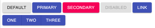
次の例では、Button コンポーネントと、ButtonGroup コンポーネントを使っています。
import { Button, ButtonGroup } from '@material-ui/core'

export default function Home() {
  return (
    <>
      <div style={{ margin: '0.5em' }}>
        <Button variant="contained">Default</Button>{' '}
        <Button variant="contained" color="primary">Primary</Button>{' '}
        <Button variant="contained" color="secondary">Secondary</Button>{' '}
        <Button variant="contained" disabled>Disabled</Button>{' '}
        <Button variant="contained" color="primary" href="https://google.com/">LINK</Button>
      </div>
      <div style={{ margin: '0.5em' }}>
        <ButtonGroup variant="contained" color="primary" aria-label="contained primary button group">
          <Button>One</Button>
          <Button>Two</Button>
          <Button>Three</Button>
        </ButtonGroup>
      </div>
    </>
  )
}
Next.js 用の App / Document コンポーネント設定
Material-UI を Next.js アプリから使用する場合は、サーバーサイドレンダリングとの兼ね合いで、pages/_app.tsx と pages/_document.tsx を作成して、スタイル定義の処理順序を制御しておく必要があります。
これを入れておかないと、makeStyle などを使ったスタイル設定 がうまく反映されず、次のようなエラーになったりします。
Warning: Prop `className` did not match.
Server: "MuiTypography-root makeStyles-customText-5 ..."
Client: "MuiTypography-root makeStyles-customText-1 ..."
これは、サーバーサイド側で生成された CSS クラス名が、クライアント側で参照しようとしているクラス名と食い違ってしまった場合に発生します(クラス名を自動生成する仕組みのため、タイミングによって発生します)。 具体的な対応方法に関しては、Material-UI のドキュメントには下記のコードを参照、と書かれていますが、こちらは残念ながら TypeScript に対応していないので、ここでは TypeScript 化したコードを載せておきます。
import React from 'react'
import { AppProps } from 'next/app'
import Head from 'next/head'
import { CssBaseline } from '@material-ui/core'
import { ThemeProvider } from '@material-ui/core/styles'
import theme from './theme'

export default function MyApp({ Component, pageProps }: AppProps): JSX.Element {
  React.useEffect(() => {
    // Remove the server-side injected CSS.
    const jssStyles = document.querySelector('#jss-server-side')
    jssStyles?.parentElement?.removeChild(jssStyles)
  }, [])

  return (
    <>
      <Head>
        <title>MyApp</title>
        <meta
          name="viewport"
          content="minimum-scale=1, initial-scale=1, width=device-width"
        />
      </Head>
      <ThemeProvider theme={theme}>
        <CssBaseline />
        <Component {...pageProps} />
      </ThemeProvider>
    </>
  )
}
pages/_document.tsx では、Roboto フォントの読み込みも行っています。
import React from 'react'
import Document, {
  DocumentContext,
  DocumentInitialProps,
  Html,
  Head,
  Main,
  NextScript,
} from 'next/document'
import { ServerStyleSheets } from '@material-ui/core/styles'
import theme from './theme'

export default class MyDocument extends Document {
  render(): JSX.Element {
    return (
      <Html lang="ja">
        <Head>
          {/* PWA primary color */}
          <meta name="theme-color" content={theme.palette.primary.main} />
          <link
            rel="stylesheet"
            href="https://fonts.googleapis.com/css?family=Roboto:300,400,500,700&display=swap"
          />
        </Head>
        <body>
          <Main />
          <NextScript />
        </body>
      </Html>
    )
  }

  // `getInitialProps` belongs to `_document` (instead of `_app`),
  // it's compatible with server-side generation (SSG).
  static async getInitialProps(
    ctx: DocumentContext
  ): Promise<DocumentInitialProps> {
    // Render app and page and get the context of the page with collected side effects.
    const sheets = new ServerStyleSheets()
    const originalRenderPage = ctx.renderPage

    ctx.renderPage = () =>
      originalRenderPage({
        enhanceApp: (App) => (props) => sheets.collect(<App {...props} />),
      })

    const initialProps = await Document.getInitialProps(ctx)

    return {
      ...initialProps,
      // Styles fragment is rendered after the app and page rendering finish.
      styles: [
        ...React.Children.toArray(initialProps.styles),
        sheets.getStyleElement(),
      ],
    }
  }
}
上記のファイルからテーマ設定ファイル theme.ts を参照しているので、これも作成しておきます。
サイト全体のプライマリカラーや、セカンダリカラーをここで設定できます。
import { createMuiTheme } from '@material-ui/core/styles'
import { red } from '@material-ui/core/colors'

const theme = createMuiTheme({
  palette: {
    //primary: {
    //  main: '#556cd6',
    //},
    //secondary: {
    //  main: '#19857b',
    //},
    error: {
      main: red.A400,
    },
    background: {
      default: '#fff',
    },
  },
})

export default theme